Light House Financial
How Curious House created the Light House Financial brand identity, logo design, colour system and typography guidelines for a Birmingham-based independent financial adviser.
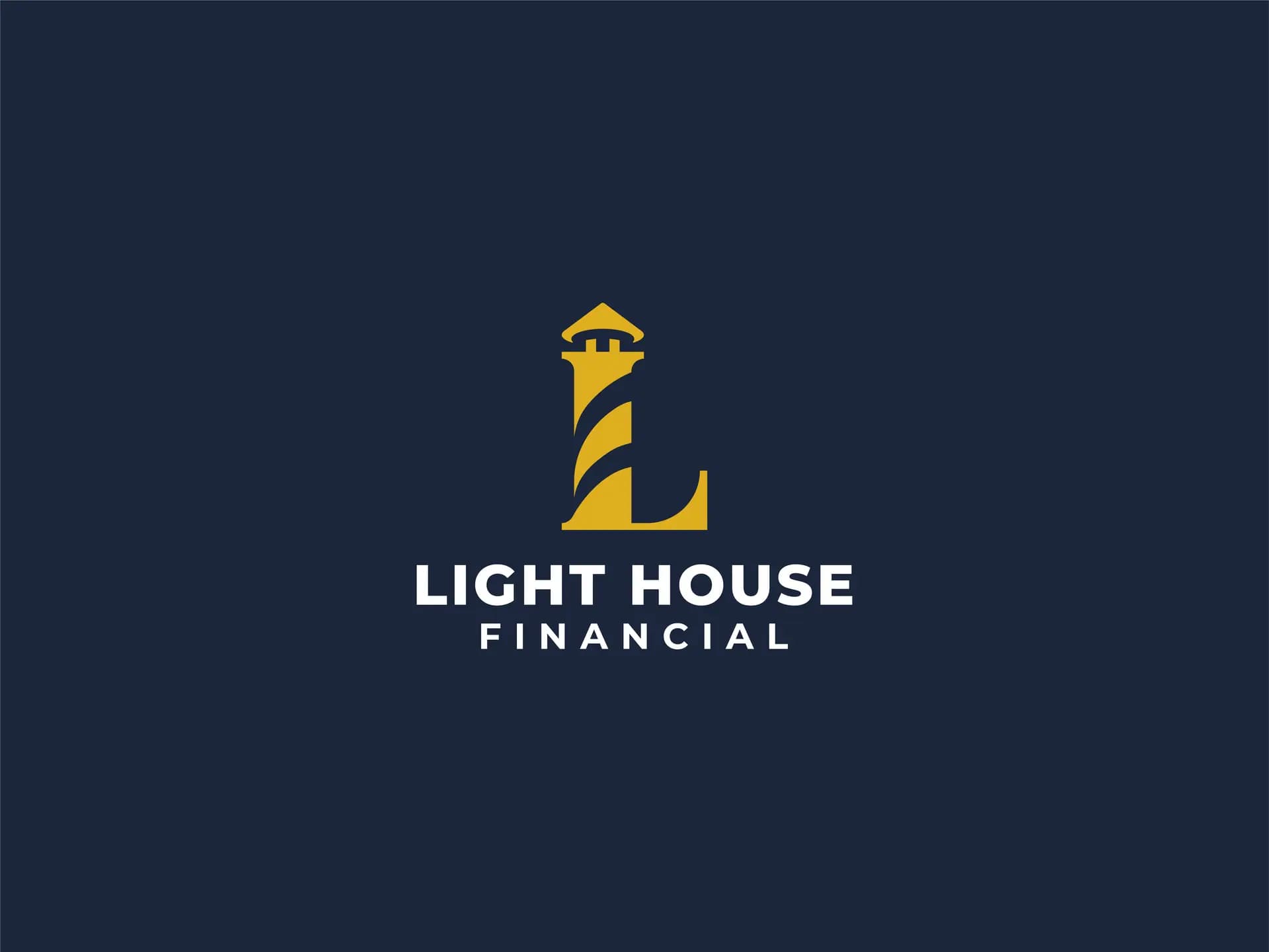
Delivered in full from workshop to brand standards
Horizontal, vertical, and standalone symbol logo suite
Defined for digital screen RGB and print CMYK/Pantone
Complete brand manual for flawless future touchpoints
Brand Positioning: Sector Cliché vs Chartered Authority
How Curious House distilled the founder's vision of 'Guiding Light' and 'Protective House' into a commanding financial identity.
- ✓Dual-Concept Symbol: Lighthouse mark doubling as an L initial with built-in upward financial growth arrow.
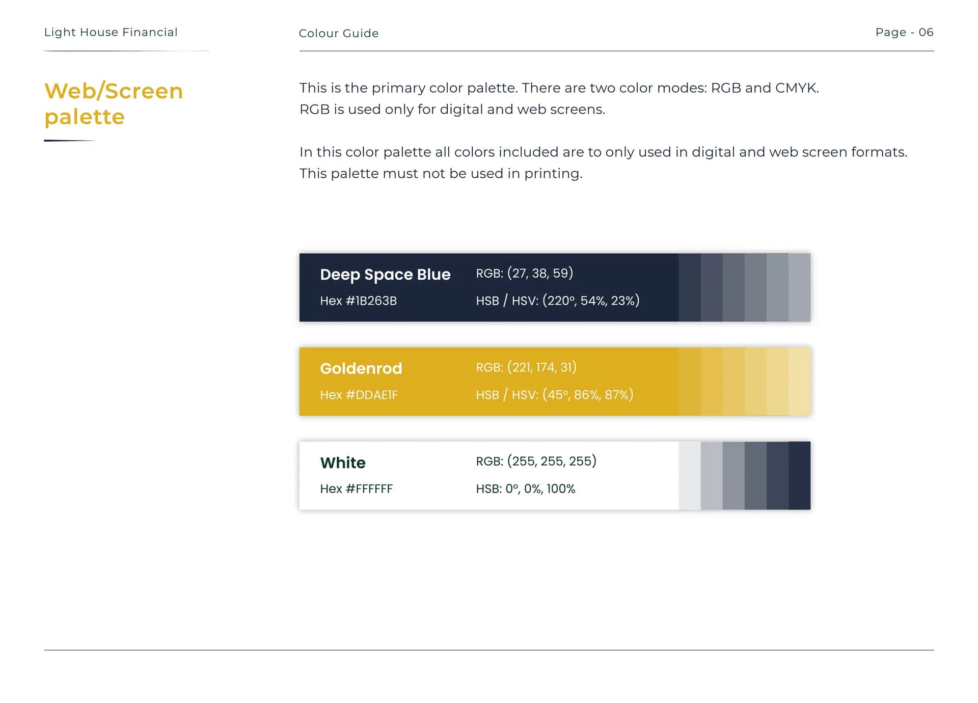
- ✓Deep Space Blue & Goldenrod: Bespoke palette communicating stability, authority, and aspiration across screen and print.
- ✓Complete Brand Guidelines Manual: Delivered in full for seamless handoff to designers, printers, and developers.
The Challenge
A leading financial adviser was stepping out on his own. After years building his reputation working for others, he was launching Light House Financial and needed a brand that communicated everything that reputation stood for.
He came with a concept already forming. Two ideas he wanted to bring together: a guiding light, representing the role of a trusted financial adviser in helping clients navigate complex decisions. And the idea of a house as an overseer, a structure that protects and provides perspective.
The brief also had a colour challenge. The client had a wide range of colours in mind and strong opinions on direction. Our job was to take those instincts and refine them into something that actually worked, a palette that could carry the weight of a financial services brand without looking like every other firm in the sector.
What We Did
We started with a series of workshop sessions to understand the client's vision, his market and his ideal clients. The colour conversation was an important part of those sessions. Rather than presenting a range and letting the client choose, we used the workshops to explore what each colour communicates, and through that process landed on something that none of the original options would have produced.
Deep Space Blue, Goldenrod and White. A palette chosen for what it says. Navy communicates stability, trust and authority. Gold communicates value, ambition and aspiration. White gives it room to breathe. Together they position Light House Financial at the higher end of the market without feeling cold or corporate.
The logo brought the two founding concepts together in a single mark. The lighthouse form doubles as an L shape, the brand's initial. An upward arrow is built into the structure of the building, pointing to growth and progression. Simple, classic and designed to last.
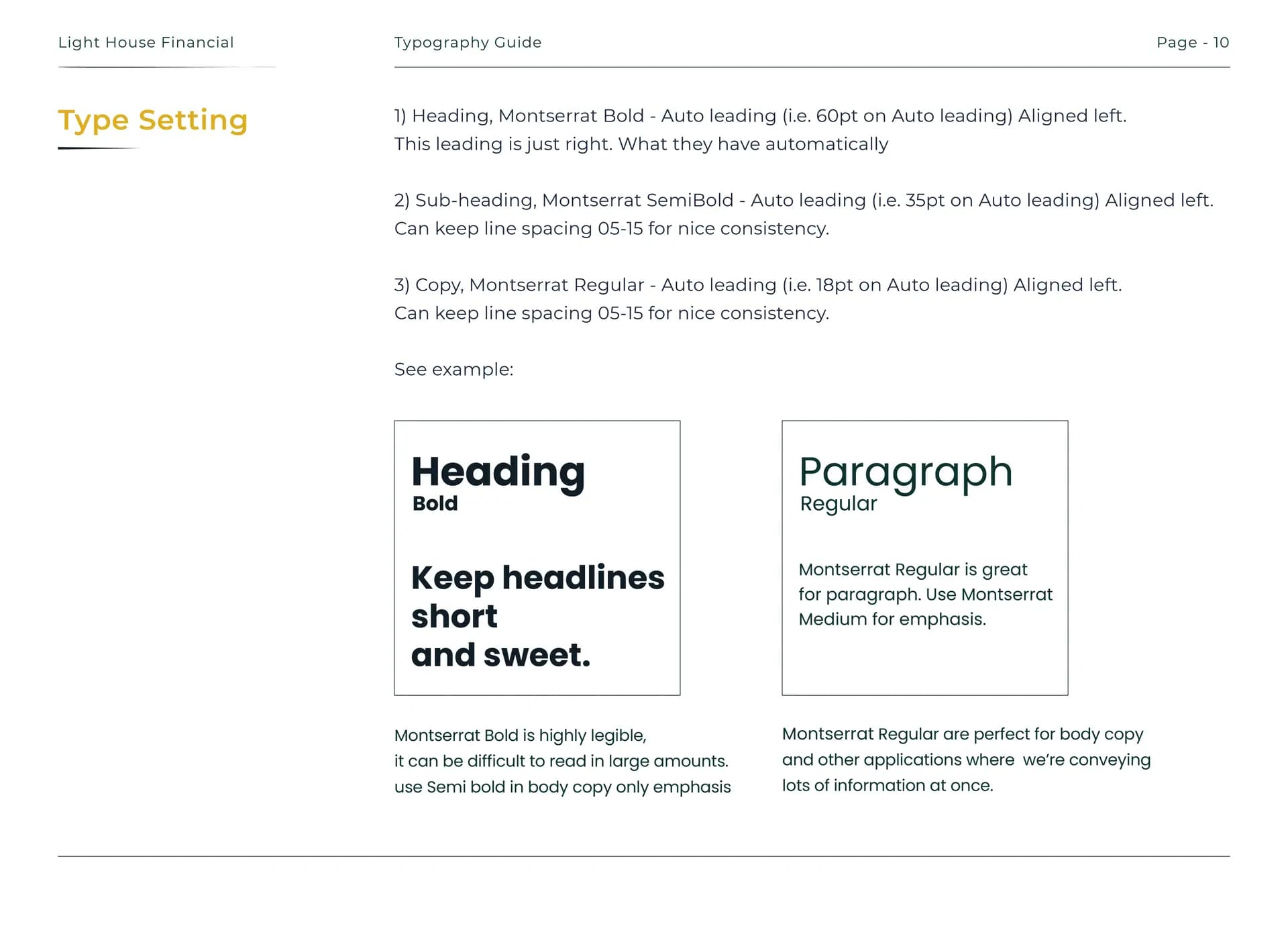
From the logo we built out the full brand system: horizontal, vertical and symbol variants, colour usage rules, typography guidelines using Montserrat across all weights, and a complete brand guidelines document the client could hand to any designer, printer or developer to maintain consistency going forward.
The Result
A complete brand identity from scratch, logo in three variants, a colour system built for digital and print, and full typography guidelines
A logo that carries two concepts in one mark, the lighthouse form, the L initial and an upward arrow for financial growth, all in a single clean symbol
A brand guidelines document delivered in full, giving Light House Financial everything needed to maintain consistency across every touchpoint going forward
Delivered in 2 to 3 weeks. The client was delighted with the outcome. The brand now reflects where the business is heading, not where it started.
Interactive Design System
Test the confirmed typography scale and click color swatches to copy brand hex tokens.
Official Light House Financial Deep Space Blue, Goldenrod, and Pure White system.
Deliverables Suite
Delivered in full, providing Light House Financial with complete brand standards across digital, print, and physical touchpoints.
Website Interface in Action
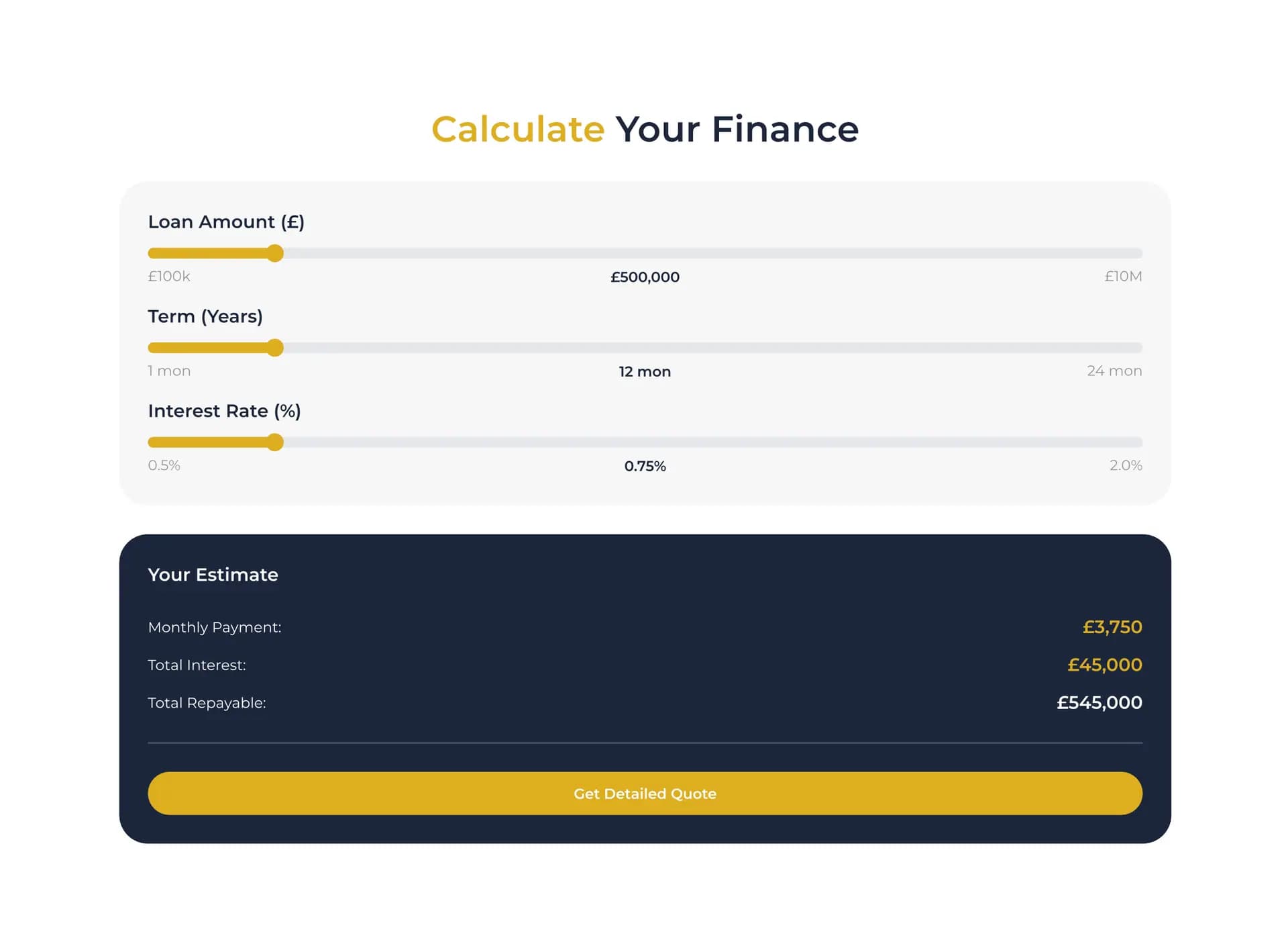
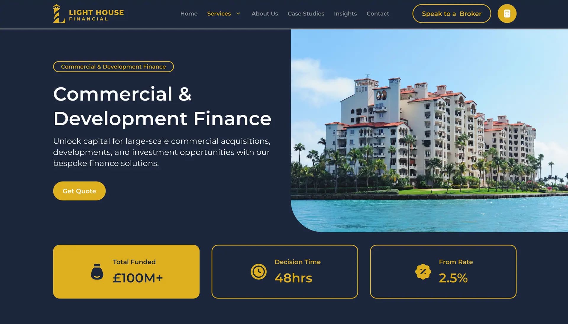
It was a pleasure working with Curious House Design. They are very knowledgeable and attentive to how we wanted our design and logo. Overall a great firm to work with and we look forward to working with them in the future.